New Controls for Ultimate Suite for PowerBuilder 2023
2023 is shaping up to be an exciting year for Ultimate Suite for PowerBuilder. With our up-coming 2023 R1 release, we'll have a total of 5 new controls added to the suite.
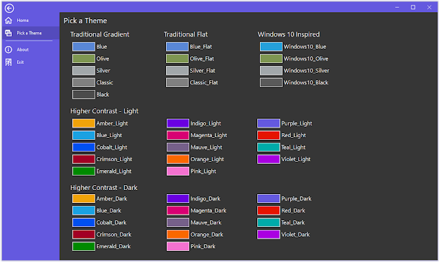
With the next release, Ultimate Suite for PowerBuilder will have a total of 40 controls, 4 datawindow controls, 5 windows, and 44 themes!
Let's introduce the new controls:
Pagination
The Pagination control displays a row of pages that a user can select. The control automatically renders based on the currently selected page and the total number of pages specified. The control offers several ways to customize its look. The developer can set the maximum number of pages to display, show or hide the paging gap (the ...), show or hide the first and last pages (page 30 is visible in these screenshots), and finally, the font, font size, and horizontal alignment.
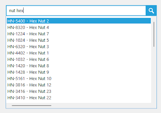
PowerSearch comes in three varieties; a non-visual component, a search box, and a search drop down. Each control uses the same underlying search function to fuzzy match a users input to a list of supplied data.
Using the non-visual component allows you to use the fuzzy search function with your own UI.
PowerSearchBox
With the search box, the result list is always in view. Users will see data filter as they type.
With the search drop down, the results only display as the user types (like a traditional type ahead dropdown).
BreadCrumbs
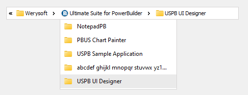
We've all used breadcrumbs at some point. This type of control provides a means to select child and parent items that displays as a flat path. The data structure for the breadcrumb is a treeview (parent and child nodes). Because of this, the programming API for the breadcrumb control models the PowerBuilder TreeView control. You will use many of the same functions to add items (InsertItemFirst, InsertItemLast, etc.), to select an item, get an item, and so on.
PowerTaskbarButton
The PowerTaskbarButton component is a non-visual component that provides an API making it possible for you to interact with your applications taskbar button (in the Windows Taskbar). You can display progress (normal, paused, error, or indeterminant), display an overlay image (like Outlook does when you receive a new email), and display up to 7 buttons in the application preview popup.
PowerWinSelector
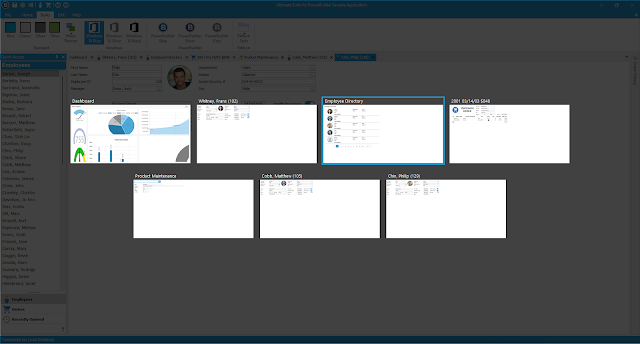
The PowerWinSelector control lets you display open windows (or userobjects) to your users. Users can then select a window to activate it. This control supports both mouse and keyboard input. There's direct support or the PowerDock control and for MDI windows. When you provide an instance of your PowerDock control or your MDI window, PowerWinSelector automatically scans for open windows or sheets and displays them to the user. Alternatively, you can manually specify which windows or user objects you want to display.
This control supports USPB Themes.
A lot of work has gone into the 2023 release of Ultimate Suite for PowerBuilder. We hope you find these new controls useful in your own applications.


Comments
Post a Comment