Posts

PowerSchedule - A New Scheduling and Calendar Control for PowerBuilder Applications

Image
In the ever-evolving landscape of application development, staying ahead requires the integration of powerful and flexible tools. PowerBuilder developers will now have an exciting addition to their toolkit – PowerSchedule. This scheduling control is designed to empower developers with extensive customization, seamlessly integrating scheduling capabilities into their PowerBuilder applications. Introducing PowerSchedule Due to release in early January 2024, PowerSchedule is not just another scheduling tool; it's a robust solution developed in PowerBuilder to address the unique needs of PowerBuilder developers. This new scheduling control allows developers to take full control of their application's scheduling functionalities while maintaining the efficiency and user-friendliness that PowerBuilder is known for. Key Features: Highly Customizable Interface: PowerSchedule boasts a user-friendly interface that is not only intuitive but also highly customizable. Developers can tailor

New Controls for Ultimate Suite for PowerBuilder 2023

Image
2023 is shaping up to be an exciting year for Ultimate Suite for PowerBuilder. With our up-coming 2023 R1 release, we'll have a total of 5 new controls added to the suite.  With the next release, Ultimate Suite for PowerBuilder will have a total of 40 controls, 4 datawindow controls, 5 windows, and 44 themes! Let's introduce the new controls: Pagination The Pagination control displays a row of pages that a user can select. The control automatically renders based on the currently selected page and the total number of pages specified. The control offers several ways to customize its look. The developer can set the maximum number of pages to display, show or hide the paging gap (the ...), show or hide the first and last pages (page 30 is visible in these screenshots), and finally, the font, font size, and horizontal alignment. PowerSearch PowerSearch comes in three varieties; a non-visual component, a search box, and a search drop down. Each control uses the same underlying search

PowerBuilder Trackbar; reinvented (also introducing a new Rangebar control)

Image
Out of the box, PowerBuilder comes with a very usable horizontal and vertical trackbar. It works as advertised; your users can move the slider to select a value that falls within a predefined Min and Max value range. Very simple. When developing the Image Editor control for Ultimate Suite; a major limitation was discovered with the PowerBuilder Trackbar. I needed a way for users to select the brightness or contrast for an image. It seemed logical to use a trackbar for this. For example, we have a min and max brightness and we need the user to select a value in that range. After placing the trackbar on the image editor control the first thing that I had to do was change the controls background color so that it matches the color scheme I was using. But... to my surprise, there is no background color property for the trackbar. This seemed odd seeing that most controls in PowerBuilder have a background color option. Some research was done to see if there was an API I could hit to change th

NotepadPB - PowerBuilder Built Notepad

Image
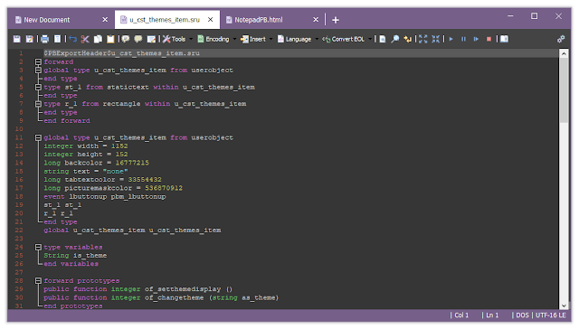
The latest release of Ultimate Suite introduces many new color themes that you can use to make your PowerBuilder applications look absolutely amazing. NotepadPB is a text editor built using PowerBuilder. The latest release takes advantage of the new Ultimate Suite color themes allowing you to customize your text editor using your favorite colors. If you're unfamiliar with NotepadPB; it's a simple text editor application with tons of features. What makes it special is that, unlike other text editors, you will find PowerBuilder specific features. If you open a PowerBuilder source file you get proper syntax highlighting, code folding, a code beautifier, go to definition when you right click on a function declaration, and so much more. In addition to the PowerBuilder related features, you get other things like: Tabbed navigation. Advanced find and replace indicators Language support for many popular programming languages. Tools to manipulate your text. Easily insert new GUIDs, calc

Image Editor for PowerBuilder

Image
The latest release of Ultimate Suite for PowerBuilder includes a handy new Image Editor control. Give your users the ability to view and manipulate images directly in your PowerBuilder application. The control supports two ways to load images. You can pick a file from the file system, or you can paste an image that's in your clipboard. Save and Save As lets you save changes to an existing file or to a new file. The Image Editor also supports unlimited Undo and Redo actions. Many options have been added for image manipulation. This control allows your user to do the following: Rotate the image left or right. Flip the image horizontally or vertically. Crop Apply effects: Set brightness and contrast. Grey scale. Black and white. Invert colors. Apply a Sepia tone. Last but not least; you can zoom and pan your image. Implementing is extremely simple; Add the u_cst_imageeditor component to any of your window or userobject objects. Toolbar images are provided but you can easily swap them

32 New Color Themes!

Image
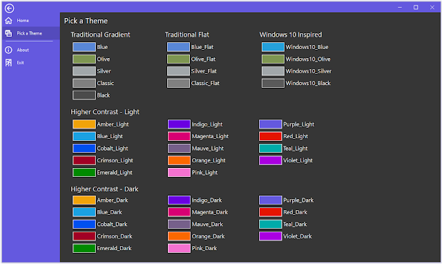
The 2021 R1 release of Ultimate Suite for PowerBuilder will contain 32 new color themes. 4 of the theme's are based on the traditional Blue, Olive, Silver, and Classic themes. They have been flattened to give a more modern appearance (remember when gradience was all the rage).  The remaining 28 themes are higher contrast. These 28 themes are made up of 14 base accent colors. Some of the colors are bold, some are more neutral. Each color has 2 variants, light and dark. Colors are becoming more important in applications. They help you create beautify, distinct interfaces. In addition to colors, dark themes are also becoming ever more popular. With the addition of new theme colors to Ultimate Suite, your options to create the most modern looking application has never been easier. For more information about Ultimate Suite for PowerBuilder, visit https://www.pbultimatesuite.com .

Product Tours w\ Ultimate Suite for PowerBuilder

Image
If you use web or mobile apps enough, you've most likely experienced a product tour at some point. Product Tours guide you through an application, pointing out important features and to a certain degree, how to use them. The 2021 R1 release of Ultimate Suite for PowerBuilder will have a new Product\Feature Tour control that will allow you to setup a tour of your application (the visible parts) or call out a single new feature. In addition to pointing out new or existing features, you could also use it to point out important validation issues. You can use a variety of predefined colors for each callout allowing you to customize the look for the action. Multi-Step Product Tour Single Feature Callout Stay tuned for the up coming 2021 R1 release. For more information about Ultimate Suite for PowerBuilder, visit www.pbultimatesuite.com .