Posts

32 New Color Themes!

Image
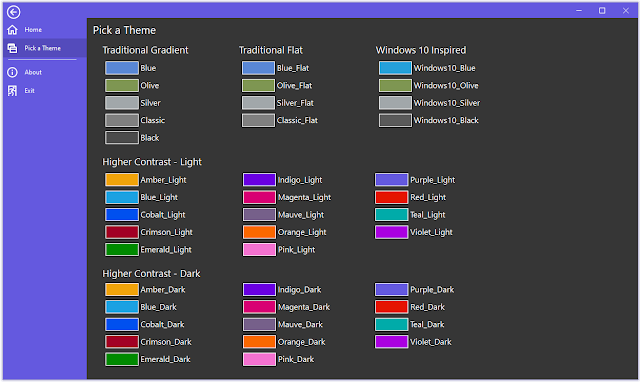
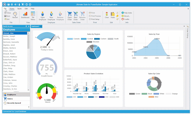
The 2021 R1 release of Ultimate Suite for PowerBuilder will contain 32 new color themes. 4 of the theme's are based on the traditional Blue, Olive, Silver, and Classic themes. They have been flattened to give a more modern appearance (remember when gradience was all the rage).  The remaining 28 themes are higher contrast. These 28 themes are made up of 14 base accent colors. Some of the colors are bold, some are more neutral. Each color has 2 variants, light and dark. Colors are becoming more important in applications. They help you create beautify, distinct interfaces. In addition to colors, dark themes are also becoming ever more popular. With the addition of new theme colors to Ultimate Suite, your options to create the most modern looking application has never been easier. For more information about Ultimate Suite for PowerBuilder, visit https://www.pbultimatesuite.com .

Product Tours w\ Ultimate Suite for PowerBuilder

Image
If you use web or mobile apps enough, you've most likely experienced a product tour at some point. Product Tours guide you through an application, pointing out important features and to a certain degree, how to use them. The 2021 R1 release of Ultimate Suite for PowerBuilder will have a new Product\Feature Tour control that will allow you to setup a tour of your application (the visible parts) or call out a single new feature. In addition to pointing out new or existing features, you could also use it to point out important validation issues. You can use a variety of predefined colors for each callout allowing you to customize the look for the action. Multi-Step Product Tour Single Feature Callout Stay tuned for the up coming 2021 R1 release. For more information about Ultimate Suite for PowerBuilder, visit www.pbultimatesuite.com .

Ultimate Suite 2021 for PowerBuilder - Released

Image
After many long months of development, the 2021 release of Ultimate Suite for PowerBuilder is now available. This is one of the largest releases of Ultimate Suite in recent history. Many new controls have been added, new Datawindow controls have been introduced, and existing controls have been enhanced. For a summary of the new controls and some of the enhancements in this release, refer to the following post: https://powertothebuilder.blogspot.com/2020/09/new-controls-coming-in-next-release.html For a summary of the new Datawindow controls, refer to the following post: https://powertothebuilder.blogspot.com/2020/11/new-controls-for-your-powerbuilder.html In addition to updated controls, this release contains significant enhancements to the UI Designer: Nearly all the controls have been added to the UI Designer. Finally added Open, Save, and Save As functions so you can save settings and change them later. Incorporated new flyout program tab menu. Changed a lot of the generated code to

New Controls for your PowerBuilder Datawindow

Image
It seems that over the years, I usually declare the next release of Ultimate Suite for PowerBuilder as the most exciting. For me, this is usually true; it's exciting to be able to provide PowerBuilder developers not only with new UI Controls to help update the look of their applications, but to provide controls that help extend functionality (allowing you to add new features to your applications). The Ultimate Suite 2021 release has a new set of controls for your windows and user objects. In addition to this, some of these new controls have been brought into the datawindow. Most of our PowerBuilder applications are heavily data driven and rely on the datawindow to display and persist data. Having new UI controls available right in the datawindow will make it easier for you to use them in your applications; Easier to display, print, or export to PDF. Here is a rundown of the new datawindow UI controls: Circle Progress This control is used to visually display a percentage or progress

Media Player Built Entirely with PowerBuilder and Ultimate Suite for PowerBuilder

Image
The next release of Ultimate Suite is going to include a new Circle Progress control. The best way to make sure that a new control covers all the needs of the developer is to use it in a real world application. Doing this allows you to identify deficiencies in the design or behavior. The best way I could think of to do this was to use the Circle Progress control within a media player. It can be used to start or pause playback and display the video's elapsed time. Using the Ultimate Suite caption-less window, some toolbars, the circle progress control and the Windows Media Player Active-X control, we get the following: To create this, first inherit a new window from w_pbus_spa_captionless. Add a logo, static text for the application label, two toolbars for the play back options, and the circle progress control. Next, add an OLE control and select Windows Media Player. In the open event of the window, add the following code: //Use a custom color for the window background color THIS .

New Controls Coming in the Next Release of Ultimate Suite for PowerBuilder!

Image
 A lot of work is going into the next release of Ultimate Suite for PowerBuilder. Here are some of the highlights: Progress Indicator on the PB Command Button You will be able to display a visual indicating progress right within the PB command button. Look for the new of_SetProgress function. Circle Progress Control The Circle Progress control allows you to visual display a percentage of completion. Customizable features include theme, circle thickness, font, and font size. Instead of displaying a percentage, you can display an image in the center of the circle. Stepbar Control The Stepbar control is perfect for displaying overall progress through a series of more complex steps. Any number of steps are allowed and will size to fix the width or height of the control. Both horizontal and vertical orientations are supported.  Card Control Cards are a nice way to combine imagery with text.  Image Compare Control If your users need to compare two images, this control can help you minimize t

PowerBuilder Code Beautifier / Formatter

Image
 A new code beautifier for PowerBuilder (PowerScript) code has been added to NotepadPB: https://powertothebuilder.com/NotepadPB.html This is the first and initial version which uses a very simple approach to formatting the code. NotepadPB will use multiple passes to adjust spacing, casing, and indenting of the script. The process works as follows: Start by tokenizing the script by splitting everything into words or characters (characters for things like quotes). We then loop through each token and determine if it's a keyword, datatype, quote, comment, carriage return, or user defined text (like variable names). We change the case on keywords and datatypes, and track indent level if the keyword is an indent-able keyword (e.g. IF, FOR, CHOOSE, etc). Comments and quoted text are ignored, we don't want to modify them. At the end, we reassemble our script. In our second pass, we parse our script by line. We will apply some formatting on a line by line bases. The second pass is meant